-
등록된 팝업이 없습니다.

지난전시
지난전시

- 전시
- 지난전시
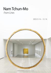
남춘모 초대전
- 전시명:From Lines
- 전시장소:인당뮤지엄 전시실
- 전시기간:2023-09-14 ~ 2023-12-14
- 첨부파일:
 [웹용도록]2023 남춘모초대전 From Lines_pdf.pdf
땅따먹기...생각나세요?
운동장 한편에 나뭇가지로 선 하나 그었을 뿐인데
이쪽은 내 땅 저쪽은 친구의 것
더 나아가기도 하고 애를 태우며 빼앗기도 하고
누워있던 것을 일으켜 세우는 지난한 세월을
요즘 가상화면으로 몇 초 만에 뚝딱 선이 면이 되고, 공간으로 확장되는
시·공간의 혼돈과 무한복제로 상쇄시키지만 그럴수록 다랑이논이 휘두른 유려한 붓질과
그 선을 따라 흐르는 촌부의 묵은 땀이 더욱 그리울 따름입니다.
모든 것의 시작은 대지였고
자기 세계를 지켜내고자 몰입으로 일궈낸 한 평의 경작지
그 땅의 뜨거운 숨결을 듣고자 모시게 되었습니다.
2023년 9월
대구보건대학교 총장 남성희
Do you remember a playground game hopscotch?
Few simple lines scratched out by a broken branch.
On one side was my land, and on the other side was my friend's land.
We would advance, struggle, snatch, and compete.
How about all these years that stood everything up from lying down?
These days, with a few seconds in a virtual screen,
a drawn line becomes a plane, and the chaos of time and space expanding is nullified by infinite replication.
That’s why especially in this time, the graceful strokes wielded by the plow,
and the sweat of a country farmer flowing along those lines become even more nostalgic.
Everything began with the land.
And here we are, inviting you to one-square-meter plot that was cultivated to protect its own world,
and to listen to the warm breath of the land.
September, 2023
President of Daegu Health College Nam SungHee
전시실 전경
남 춘 모
1961 경북 영양 출생
1982-88 계명대학교 미술대학 및 동대학원 졸업
개인전
2023 From Lines, 대구보건대학교 인당뮤지엄, 대구, 한국
2022 Spring, Ceysson & Bénétière, 생테티엔, 프랑스
Gesture in Lines, Gallery Dorothea van der Koelen, 마인츠, 독일
Lines from Gesture, 파워롱미술관, 상하이, 중국
Gesture in Lines, Ceysson & Bénétière, 뉴욕, 미국
2020 Lines in Space, 리안갤러리, 대구, 한국
Master of Lines, Ceysson & Bénétière, 파리, 프랑스
2019 Gesture in Space, 루드비히 미술관, 코블렌츠, 독일
남춘모, 리안갤러리, 서울, 한국
2018 풍경이 된 선, 대구미술관, 대구, 한국
선의 충돌과 재확산, 경남도립미술관, 창원, 한국
2017 Blackcolor, 안도파인아트, 베를린, 독일
2016 남춘모, 리안갤러리, 대구, 한국
Art’Loft, 브뤼셀, 벨기에
2015 남춘모, 리안갤러리, 서울, 한국
Where Light and Dark Collide, 안도파인아트, 베를린, 독일
Beam 2015, 쿤스트라움21, 본, 독일
2014 갤러리 604, 부산, 한국
갤러리 예동, 부산, 한국
2013 Holly Hunt & Nam Tchun-Mo, 홀리 헌트, 뉴욕, 미국
IBU 갤러리, 파리, 프랑스
스페이스 홍지, 서울, 한국
2012 갤러리 M, 대구, 한국
BIBI 스페이스, 대전, 한국
Galerie Landskron Schneidzik, 뉘른베르크, 독일
2011 IBU 갤러리, 파리, 프랑스
2010 아뜰리에24, 겔터킨덴, 스위스
데이트 갤러리, 부산, 한국
2009 IBU 갤러리, 파리, 프랑스
석 갤러리, 대구, 한국
2008 갤러리 우베 삭소프스키, 하이델베르크, 독일
갤러리 F5, 베이징, 중국
2007 카이스 갤러리, 서울, 한국
2005 아뜰리에24, 겔터킨덴, 스위스
이현 갤러리, 대구, 한국
2004 조현 화랑, 부산, 한국
2003 카이스 갤러리, 서울, 한국
2002 이현 갤러리, 대구, 한국
2001 박여숙 화랑, 서울, 한국
금호미술관, 서울, 한국
현대예술관, 울산, 한국
갤러리 M, 대구, 한국
2000 시공 갤러리, 대구, 한국
조현 화랑, 부산, 한국
1998 시공 갤러리, 대구, 한국
1996 시공 갤러리, 대구, 한국
1994 갤러리 에피쿠르, 부퍼탈, 독일
1993 갤러리 삭스-물티굴트, 프랑크푸르트, 독일
1992 두빛 갤러리, 대구, 한국
1989 예맥 화랑, 대구, 한국
그룹전
2023 Blue-The Colour of the Place, Gallery Dorothea van der Koelen, 베니스, 이탈리아
빛을 찾아서, 수성아트피아, 대구, 한국
2021 클라우디아 훼렌켐퍼/남춘모/헤르베르트 멜러, 빌라프리더미술관, 본, 독일
Lines of Perfection, 헤이그 미술관, 헤이그, 네덜란드
만향, 대구보건대학교 인당뮤지엄, 대구, 한국
2020 텅 빈 충만, 박여숙 화랑, 서울, 한국
2018 한국의 후기 단색화, 리안갤러리, 서울, 한국
Absence, Art’Loft, 브뤼셀, 벨기에
2017 Beautiful Black, 리안갤러리, 대구, 한국
2016 Made in the EAST, MDZ Art 갤러리, 크노케, 벨기에
쿤스트타게 비닝겐, 비닝겐, 독일
변화하는 시간, 쿤스트라움21, 본, 독일
2015 코리아 투모로우 2015, 성곡미술관, 서울, 한국
Leading Artists 2015, 대구문화예술회관, 대구, 한국
한국현대미술 초대전, 울산문화예술회관, 울산, 한국
2014 AHA, 쿤스트라움21, 본, 독일
Painting not Painting, 박여숙 화랑, 서울, 한국
2013 갤러리 라우스베르그 10주년 기념전, 뒤셀도르프, 독일
Trois Accords (이교준, 이배, 남춘모) 동원 화랑, 대구, 한국
한국 현대미술의 재구성, ICAS, 싱가포르
색 : 감성을 속삭이다, 일우스페이스, 서울, 한국
2012 한국의 모노크롬, 반더쿨렌 갤러리, 마인츠, 독일
한국의 단색화, 국립현대미술관, 과천, 한국
빛과 색, Space BBK, 쾰른, 독일
2011 Made in Daegu, 대구미술관, 대구, 한국
기하학적 추상, 갤러리 라우스베르그, 뒤셀도르프, 독일
절제된 미학, 통인 옥션 갤러리, 서울, 한국
2010 Iwami 국제현대미술제, 이와미, 일본
In Side Out, 봉산문화회관, 대구, 한국
오늘의 청년 작가전, 대구문화예술회관, 대구, 한국
2009 리듬, 조형, 교감 : 스펙트럼전, 세종문화회관, 서울, 한국
8인전, New Painting , 갤러리 yfo, 대구, 한국
Painted Painting, 아트파크, 서울, 한국
2008 진공의 공간, 갤러리 쌈지, 서울, 한국
색, 면, 공간, 갤러리목금토, 서울, 한국
2007 Art in Life, 몰테니&C, 서울, 한국
2006 빛과 마음전, 신미술관, 청주, 한국
2006 부산비엔날레 바다미술제, 부산, 한국
사각의 색채, 갤러리 M, 대구, 한국
2004 한국평면회화의 어제와 오늘, 서울시립미술관, 서울, 한국
금호미술관 개관 15주년 특별전, 금호미술관, 서울, 한국
남춘모-비치가이오전, 라인란트팔츠주 국회의사당, 마인츠, 독일
SUM of the Contemporary, 대구문화예술회관, 대구, 한국
나가사키 현대미술전, 나가사키, 일본
2003 아름다움전, 성곡미술관, 서울, 한국
유쾌한 공작소, 서울시립미술관, 서울, 한국
Happiness, Art Space M-POST, 서울, 한국
20주년 기념전, 박여숙 화랑, 서울, 한국
2002 미적인 또 다른 만남전, 나인갤러리, 광주, 한국
2002 대구현대미술제, 대구문화예술회관, 대구, 한국
현대미술 초대전, 대구문화예술회관, 대구, 한국
9월 9인전, BIBI 스페이스, 대전, 한국
동거동락전, 박여숙 화랑, 서울, 한국
2001 한국미술 2001 : 회화의 복권, 국립현대미술관, 과천, 한국
休(휴)전, 성곡미술관, 서울, 한국
주요작품소장
갈릴라 홀란더 컬렉션, 브뤼셀, 벨기에
경남도립미술관, 창원, 한국
경북대학교, 대구, 한국
국립현대미술관, 과천, 한국
금호미술관, 서울, 한국
대구문화예술회관, 대구, 한국
대구미술관, 대구, 한국
대구보건대학교 인당뮤지엄, 대구, 한국
대구월드컵경기장, 대구, 한국
루드비히 미술관, 코블렌츠, 독일
리움-삼성미술관, 서울, 한국
미술은행, 과천, 한국
부산시립미술관, 부산, 한국
서울시립미술관, 서울, 한국
스웨덴 한국대사관, 스톡홀름, 스웨덴
코오롱, 서울, 한국
파워롱미술관, 상하이, 중국
파크원, 서울, 한국
현대중공업, 울산, 한국
CAD 인터내셔널, 마이애미, 미국
HJ 타워, 서울, 한국
Mulliez, Group Auchan, 프랑스
Schott Music GmbH & CO. KG, 마인츠, 독일
Nam Tchun-Mo
1961 Born in Yeongyang, Korea
1982-88 B.F.A., Keimyung University, Daegu, Korea
M.F.A., Keimyung University, Daegu, Korea
Selected Solo Exhibitions
2023 From Lines, Indang Museum of Daegu Health College, Daegu, Korea
2022 Spring, Ceysson & Bénétière, Saint-Étienne, France
Gesture in Lines, Gallery Dorothea van der Koelen, Mainz, Germany
Lines from Gesture, Powerlong Museum, Shanghai, China
Gesture in Lines, Ceysson & Bénétière, New York, USA
2020 Line in Space, Leeahn Gallery, Daegu, Korea
Master of Lines, Ceysson & Bénétière, Paris, France
2019 Gesture in Space, Ludwig Museum, Koblenz, Germany
Nam Tchun-Mo, Leeahn Gallery, Seoul, Korea
2018 From Lines to Landscape, Daegu Art Museum, Daegu, Korea
Collision and Respreading of Lines, Gyeongnam Art Museum, Changwon, Korea
2017 Blackcolor, AAando Fine Art, Berlin, Germany
2016 Nam Tchun-Mo, Leeahn Gallery, Daegu, Korea
Art’Loft, Brussel, Belgium
2015 Nam Tchun-Mo, Leeahn Gallery, Seoul, Korea
Where Light and Dark Collide, AAando Fine Art, Berlin, Germany
Beam 2015, Kunstraum21, Bonn, Germany
2014 Gallery 604, Busan, Korea
Gallery Yedong, Busan, Korea
2013 Holly Hunt & Nam Tchun-Mo, Holly Hunt, New York, USA
IBU Gallery, Paris, France
Space Hongjee, Seoul, Korea
2012 Gallery M, Daegu, Korea
BIBI Space, Daejeon, Korea
Galerie Landskron Schneidzik, Nurnberg, Germany
2011 IBU Gallery, Paris, France
2010 Atelier24, Gelterkinden, Switzerland
Date Gallery, Busan, Korea
2009 IBU Gallery, Paris, France
Seok Gallery, Daegu, Korea
2008 Gallery Uwe Sacksofsky, Heidelberg, Germany
Gallery F5, Beijing, China
2007 CAIS Gallery, Seoul, Korea
2005 Atelier24, Gelterkinden, Switzerland
Lee Hyun Gallery, Daegu, Korea
2004 Johyun Gallery, Busan, Korea
2003 CAIS Gallery, Seoul, Korea
2002 Lee Hyun Gallery, Daegu, Korea
2001 Park Ryu Sook Gallery, Seoul, Korea
Kumho Museum, Seoul, Korea
Hyundai Arts Center, Ulsan, Korea
Gallery M, Daegu, Korea
2000 Ci Gong Gallery, Daegu, Korea
Johyun Gallery, Busan, Korea
1998 Ci Gong Gallery, Daegu, Korea
1996 Ci Gong Gallery, Daegu, Korea
1994 Galerie Epikur, Wuppertal, Germany
1993 Gallery XAS-multikult, Frankfurt, Germany
1992 Dubitz Gallery, Daegu, Korea
1989 Yemak Gallery, Daegu, Korea
Selected Group Exhibitions
2023 Blue-The Colour of the Place, Gallery Dorothea van der Koelen, Venice, Italy
Find the Light, Suseong Artpia, Daegu, Korea
2021 Claudia Fährenkemper/Nam Tchun-Mo/Herbert Mehler, Kunstraum Villa Friede, Bonn, Germany
Lines of Perfection, Kunstmuseum Den Haag, Hague, Netherlands
ManHyang_brimming scent of art, Indang Museum of Daegu Health College, Daegu, Korea
2020 The Empty of Fullness, Park Ryu Sook Gallery, Seoul, Korea
2018 The Post Dansaekhwa of Korea, Leeahn Gallery, Seoul, Korea
Absence, Art'Loft, Brussel, Belgium
2017 Beautiful Black, Leeahn Gallery, Daegu, Korea
2016 Made in the EAST, MDZ Art Gallery, Knokke, Belgium
Kunsttage Winningen, Winningen, Germany
Changing Time, Kunstraum21, Bonn, Germany
2015 Korea Tomorrow 2015, Sungkok Art Museum, Seoul, Korea
Leading Artists 2015, Daegu Arts Center, Daegu, Korea
Korean Contemporary Art, Ulsan Culture Art Center, Ulsan, Korea
2014 AHA, Kunstraum21, Bonn, Germany
Painting not Painting, Park Ryu Sook Gallery, Seoul, Korea
2013 10th Anniversary of Gallery Bernd A. Lausberg, Dusseldorf, Germany
Trois Accords (Lee Kyojun, Lee Bae, Nam Tchun-Mo), Dongwon Gallery, Daegu, Korea
Reconfiguring Contemporary Art : From a Korea Perspective, ICAS, Singapore
Color : Sentiment Whisper, ilwoo SPACE, Seoul, Korea
2012 Monochrom in Korea, Gallery Dorothea van der Koelen, Manz, Germany
Dansaekhwa, National Museum of Modern and Contemporary Art, Gwacheon, Korea
Light & Color, Space BBK, Cologne, Germany
2011 Made in Daegu, Daegu Art Museum, Daegu, Korea
Konkrete Abstraktion, Gallery Bernd A. Lausberg, Dusseldorf, Germany
Minimal Esthetics, Tong-In Auction Gallery, Seoul, Korea
2010 Iwami International Exhibition of Contemporary Art, Iwami, Japan
In Side Out, BONGSAN Cultural Center, Daegu, Korea
The Young Artists of Today, Daegu Arts Center, Daegu, Korea
2009 Rhythm, Forms, and Intimacy : Spectrum, Sejong Center, Seoul, Korea
The Exhibition of 8 Artists, New painting, Gallery yfo, Daegu, Korea
Painted Painting, ARTPARK, Seoul, Korea
2008 Vacuum Space, Gallery Ssamzie, Seoul, Korea
Color, Face, Space, Gallery Mokkumto, Seoul, Korea
2007 Art in Life, Molteni&C, Seoul, Korea
2006 Light & Mind, Shin Museum of Art, Cheongju, Korea
Sea Art Festival, Busan Biennale2006, Busan, Korea
Quadrangle's Colors, Gallery M, Daegu, Korea
2004 Monochrome Paintings of Korea, Past and Present, Seoul Museum of Art, Seoul, Korea
15th Anniversary Special Exhibition, Kumho Museum of Art, Seoul, Korea
Nam Tchun-Mo-Bitzigeio, Landtag Rheinland-Pfalz, Mainz, Germany
SUM of the Contemporary, Daegu Arts Center, Daegu, Korea
Nagasaki Contemporary Art Show, Nagasaki, Japan
2003 Extreme Beauty, Sungkok Art Museum, Seoul, Korea
A Pleasant Workshop, Seoul Museum of Art, Seoul, Korea
Happiness, Art Space M-POST, Seoul, Korea
20th Anniversary Special Exhibition, Park Ryu Sook Gallery, Seoul, Korea
2002 Aesthetic Meeting, Nine Gallery, Gwangju, Korea
2002 Daegu Contemporary Art Show, Daegu Arts Center, Daegu, Korea
Korean Contemporary Art, Daegu Arts Center, Daegu, Korea
September 9 Artists, BIBI Space, Daejeon, Korea
Share Living and Joy, Park Ryu Sook Gallery, Seoul, Korea
2001 Korea Art 2001 : Return to Painting, National Museum of Modern and Contemporary Art, Gwacheon, Korea
Refreshment, Sungkok Art Museum, Seoul, Korea
Selected Public Collections
Art Bank, Gwacheon, Korea
Busan art Museum, Busan, Korea
CAD International, Miami, USA
Daegu Arts Center, Daegu, Korea
Daegu Art Museum, Daegu, Koera
Daegu World Cup Stadium, Daegu, Korea
Embassy of the Republic of Korea in the Kingdom of Sweden, Stockholm, Sweden
GalilaBarzilai Hollander Collection, Brussel, Belgium
Gyeongnam Art Museum, Changwon, Korea
HJ Tower, Seoul, Korea
Hyundai Heavy Industries Co. Ltd, Ulsan, Korea
Indang Museum of Daegu Health College, Daegu, Korea
Kolon, Seoul, Korea
Kumho Museum, Seoul, Korea
Kyungbook National University, Daegu, Korea
Leeum, Samsung Museum of Art, Seoul, Korea
Ludwig Museum, Koblenz, Germany
Mulliez, Group Auchan, France
National Museum of Modern and Contemporary Art, Gwacheon, Korea
Parc.1, Seoul, Korea
Powerlong Museum, Shanghai, China
Schott Music GmbH & Co. KG, Mainz, Germany
Seoul Museum of Art, Seoul, Korea
남춘모: 2.5차원의 입체선(線)과 빛이 그린 그림자
케이트 림
아트플랫폼아시아 대표
많은 평론가들이 작품을 해설할 때 미술사적 선례(先例)와 해당 작품과의 공통분모를 찾은 뒤 미술사적 도식에 작품을 끼워 맞추려 하는 경향이 있다. 남춘모 작품에 대한 그동안의 여러 해설도 그 틀을 벗어나지 못하는 것 같다. 예를 들어 독일 루드비히 미술관장인 베아테 라이펜샤이드는 “남춘모의 작품은 구체적이라 묘사될 수 있으므로 유럽의 구체 미술의 전통선상에 곧바로 위치시킬 수 있다. 그의 감성적 작품들은 의심할 여지없이 구체미술으로부터 영감을 받았고 정신적으로 구체미술이 스며들어 있다”고 평했다. 구체 미술(Concrete Art)의 대표작가인 테오 반 되스버그(Theo van Doesburg)의 기하학적 추상과 남춘모를 직접적으로 연결시키려 했다.[1] 한국의 평론가 윤진섭은 “남춘모 작품의 날 선 이랑들은 … 천의 보푸라기들이 느껴질 만치 불규칙적이며 푸근한 느낌을 준다”며 “이는 한국의 단색화 작가들 작품에서 느껴지는 보편적 특징이다”라고 평했다. 남춘모 작품을 단색화 미학의 연장선상에 놓으려 한 것이다.[2]
그러나 미술사적 조명과 비평이론적 분석은 개별 작품을 바라보는 편리한 조망대일 뿐 작품의 구체적 실체를 보여주는 확대경은 아니다. 창작은 외부의 영향을 받는 동시에 그 영향에 대해 저항하고 엉뚱한 해결을 새롭게 모색하는 과정에서 태어난다. 그래서 외부 영향을 대하는 작가의 역설적이고 창조적 반응을 파악하는 것이 중요하다. 작가의 창의적 선택이 미술사조로 쉽게 재단하기 어려운 이격(離隔)을 만들어내기 때문이다. 이 글은 그 이격에 초점을 맞춰서 남춘모의 작업을 설명하고자 한다.
‘2.5차원’의 입체선(線)
남춘모 작업의 독창성은 선(線)에서 출발한다. 그 선은 피아노 건반의 여러 음(音)을 연주자가 동시에 누를 때 느껴지는 소리의 일체적 다중성같이 복합적인 경험과 관찰이 엉켜있는 선이다. 그 선의 의미의 실타래를 풀어가는 것이 남춘모의 작업 세계를 이해하는 데 도움이 된다. 이번 전시에 소개된 드로잉을 자세히 보면 그가 어떤 속성을 가진 선(線)에 주된 관심이 있었는지를 짐작할 수 있다. “Lines 1607 (charcoal on paper, 2023)”에는 마치 종이 위에 서 있는 듯한 짧고 뭉뚝한 선이 있다. 보일 듯 말 듯 하게 흐릿한 그림자 때문에 선이 서 있는 것처럼 보인다. 이 이외에도 사각 벽돌형의 굵은 선, 구불거리며 엉킨 선이 보인다. “Stroke-Lines 1903 (acrylic on canvas, 2023)”에서는 굵고 대담하게 제멋 대로인 선을 그으며 선을 회화적으로 표현했다. 빨간 선 밑에 검정색 선이 덧붙여 있고, 선들은 대칭적이지 않으며 어떤 선들은 중간에 잘려 있다. 페인트 나이프로 그은 것 같은 가느다란 자국이 수직, 수평적인 선처럼 빨강-검정 선들 위로 보이며 사선 방향의 전체 구성에 변화와 이탈을 준다. 붓질에 담긴 거친 느낌과 통제하려는 의지 사이의 긴장감이 하나로 합쳐져 입체감을 촉발한다.
남춘모에게는 어릴 적 늘상 보았던 비탈진 밭들의 모습이 시각적 추억으로 남아 창작의 단서가 되었다. 서서히 휘어지는 고랑과 이랑이 연속해서 만들어내는 밭의 풍경은 멀리서 볼 때 흙에 그려진 선처럼 보인다. 여기에서 남춘모의 시선을 끈 것은 밭에 세워진 검정 비닐하우스가 따뜻한 열을 품어 반짝이는 모습이었다. 햇빛이 닿은 비닐 표면과 햇빛이 닿지 않은 표면이 서로 교대로 이어지면서 광택과 무광택의 열병(閱兵)이 선(線)처럼 만들어졌다. 빛의 변화에 따라 이 검정선은 계속 변신했다. 선의 예술적 잠재력을 알게 해 준 경험이었다.[3]
남춘모는 이러한 경험을 작품에 응축시키기 위해 획기적인 발명을 했다. 밭 고랑의 축소판같은 ‘U’형태의 구조물을 만들어 캔버스에 붙이는 것이었다. 기다란 사각형 나무틀 위에 천을 고정시키고 그 위에 액체 레진(resin)을 붓으로 칠한 후 굳으면 나무틀에서 천을 분리시켰다. 이 천은 레진과 결합해 광목천 색으로 변해 있다. “Beam”연작은 이 천을 직선 형태로 잘라 캔버스에 붙이거나 작은 조각 단위로 만들어서 벌집처럼 붙인 후 그 위에 채색한 작품이다. 2018년부터 시작한 “Spring” 연작도 역시 이런 천 조각들을 하나씩 이어 붙여서 구부러진 형태를 만들었다. 어떤 때는 ‘U’형 구조물 안에 검정색으로 선을 직접 긋기도 했다.
결과적으로 ‘U’형 구조물의 배합에 의해 입체선(線)이 나왔다. 이것은 기하학적 추상처럼 단순화의 방향으로 나간 것이 아니다. 오히려 캔버스 평면으로부터 살짝 튀어나와 있는, 그렇지만 스스로 서 있다(free-standing)기보다는 캔버스 평면에 의존해서 서 있는 듯이 보이는 이차원과 삼차원의 중간쯤 되는 2.5 차원의 입체선을 만들어낸 것이다. 라이펜샤이드는 ‘U’형 구조물을 알았는데도 불구하고, 이것 자체를 강조하기보다 서양의 기하학적 선으로 치환해서 남춘모를 구체미술에 연결시키려 했다.
빛과 대화하는 부조화(浮彫畵): 새로운 ‘회화적 공간’의 창출
이렇게 ‘U’형태의 구조물을 캔버스와 결합시키자 캔버스 표면에 수없이 많은 작은 공간이 만들어졌다. 이 공간은 들어오는 빛의 양과 각도에 따라 자발적으로 그림자를 만들어 준다. 보통 그림에서는 햇빛이 닿지 않는 표면은 어두운색을 칠해 그림자를 만들어 깊이감을 표현하지만 남춘모의 캔버스에서는 빛이 그림자를 그려준다. 천으로 만든 다양한 크기와 길이의 입체 단위를 배열해서 붙인 부조화(浮彫畵)이기 때문에 색깔로 음영을 별도로 그릴 필요가 없다.
남춘모가 창조한 ‘U’형 구조물의 ‘공간’은 서양 미술사에서 얘기하는 ‘회화적 공간(pictorial space)’과 크게 다르다. 서양의 회화적 공간은 평면 캔버스에 색의 조율과 원근법 등을 활용해서 입체감을 불러일으키는 장치이다. 서양화의 대가들은 수 세기 동안 회화적 공간을 만드는 다양한 방법을 내놓았다. 삼차원의 실재를 이차원에 표현하는데 가장 큰 어려움은 빛이 삼차원 대상의 표면에 닿았을 때는 거의 무제한적으로 다양한 모습이 나타나는 반면 이차원 평면에 칠하는 색은 제한된 범위의 입체성 밖에는 드러내지 못한다는 데 있었다.
고전적 회화 방법이 깨지고 근대 미술의 혁신적 변화가 20세기에 걸쳐 진행되면서 캔버스 공간에 대한 생각이 극단적으로 바뀌었다. ‘회화적 공간’은 화가가 기교로 만든 ‘환영(Illusion)’일 뿐이라는 추정에 이르게 되었다. 작품이 환영이라면 과거처럼 회화적 공간을 실재와 똑같이 구현하려고 할 필요가 없다. 예전의 회화 공식을 따르지 않고 작가가 원하는 특징들을 추출해서 새로이 구성된 공간을 내놓아도 작품이 된다. 이에 따라 과거의 회화적 공간은 사라지고 그림이 평평해지는 현상이 나타났다. 여기에서 극단으로 나간 작가들이 프랭크 스텔라(Frank Stella)와 같은 미니멀리스트(minimalist)들이다. 이들은 회화적 공간의 환영조차 완전히 없애려고 했다. 스텔라는“Black Paintings”연작을 발표하면서 “당신이 보는 것이 당신이 보는 것이다(What you see is what you see)”라고 말했다. 자신의 캔버스에는 보고 있는 것 외에 다른 속임수나 환영은 전혀 없다는 말이다. 비평 이론에서는 회화적 공간을 철저히 제거한 사례로 스텔라의 작품을 높이 평가한다.[4]
남춘모는 회화적 공간을 제거한 것이 아니라 특유한 방법으로 회화적 공간을 복원했다. ‘U’형 구조물로 빛에 따라 변화하는 그림자를 직접 볼 수 있는 공간을 만들어냈다. 환영을 없애는 것이 발전 과정이라고 보는 미니멀리즘 경향에서 본다면 남춘모의 작품은 거꾸로 간 것이다. 하지만 작가 남춘모는 그 조류와 상관없이 환영과 실재가 공존하는 흥미로운 공간을 창조해냈다. 환영을 깨끗이 소독한 것이 아니라, 밝음과 그림자의 변주를 드러내는 독특한 구조물을 캔버스 위에 만들었다. 관객들은 남춘모의 작품을 통해 빛의 유희가 벌이는 시각적 사건의 원리를 알게 해주고, 환영과 함께 환영의 원리도 보게 된다.[5]
펼쳐놓은 모네를 하나로 응축
빛의 역할에 대해 남춘모와 유사한 관심을 갖고 색과 빛의 상호 작용을 탐구한 이가 클로드 모네(Claude Monet)이다. 모네는 “하루 중 서로 다른 시간대에 일어나는 빛의 변화는 너무나 현저하게 건물의 모양과 색에 영향을 미친다. 이 단 하나의 모티브를 연구해 보는 것도 사사로운 문제가 아니라고 느낀다”고 했다.[6] 모네는 “Grain Stacks”연작을 통해 벌판에 놓인 같은 볏단이 늦여름부터 겨울까지 서로 다른 햇빛 밑에서 변화하는 모습을 묘사하면서 대기의 분위기를 색과 빛의 유희로 번역했다. 그는 “각 볏단 그림은 전체 연작에서 서로 비교되고 연결되면서만이 그 개별 가치를 지닌다.” 라고 했다.[7] 모네는 루안 성당(Rouen Cathedral)의 정면도 서로 다른 시간대에 그려 보았다. 루안 성당은 건물 전체가 베이지 색 돌로 지어져 있고 정면 하단에 안으로 굽혀져 들어간 아치형 정문이 있다. 모두 4점의 루안 성당 작품 중에는 이 정문이 오렌지색으로 범벅이 된 그림이 있다. 보통 때는 그늘이 져서 어둡게 보이지만 특정 순간에 스쳐가며 쏟아진 햇빛이 그렇게 비범한 색으로 포착된 것이다.
남춘모는 “인상주의자들, 특히 모네를 생각하고 있는데, 그들은 하루에 빛의 변화 과정을 보여주기 위해서 여러 장의 그림을 그렸어야 했습니다. 나의 경우는 한 작품으로 그 과정 전체를 따를 수 있습니다.”라고 언급했다.[8] 모네가 나열을 통해 구현했던 빛과 색의 대화를 남춘모는 하나의 구조 안에서 일어나게 만들었다. 빛이 자신의 행적을 스스로 그려주는 장치를 캔버스에 장착함으로써, 연작을 만들어낸 모네식 해결을 한 작품에 응축한 것이다.
입체선이 공간에 그리는 드로잉
남춘모의 설치 작품도 ‘2.5차원’ 작품의 확장판으로 이해할 수 있다. 그는 ‘U’형 구조물 안의 그림자 부분에 검정선을 그어 부조화를 만들던 단위를 캔버스에서 끄집어내 삼차원의 설치작품으로 구현했다. 그러자 흥미있는 변화가 일어났다. ‘U’형태의 움푹 들어간 주머니가 삼차원 공간에 놓여지자 또렷한 검정선을 에워싼 부드러운 껍질같이 보인다. 남춘모는 캔버스로부터 자유로워진 이 ‘입체적 선’을 사용해 공간을 점하는 여러 형태를 만든다.
“Spring(2017-2023)”은 ‘U’형 입체선을 교차시키면서 휘어진 격자 패턴을 만든 작품이다. 이 격자 문양의 구조물 여러 개가 전시장 바닥에 서 있다. 조금씩 다른 방향으로 휘어지고 뻗어서 각각의 형태가 서로 다르다. 이 작품은 겨울 나무의 앙상한 골격 같기도 하다. 가운데 격자 패턴이 한자의 ‘밭[田]’으로 읽혀서 남춘모가 밭의 고랑과 이랑으로부터 영감을 받았다는 사실을 연상케도 한다. 형태와 의미가 합쳐진 재미있는 상징 같기도 하다. 남춘모는 자신의 선은 서예 선과는 관계가 없다고 했지만, 공간에 쓴 현대판 서예같기도 하다. 이 작품은 “무엇인 것 같다”의 구멍 숭숭 뚫린 세계를 부유하는 미지(未知)의 반(半)확정을 형태화했다.
이렇게 입체적 선을 결합해서 만든 설치 작품은 모형 제작이나 조각술에 의해 만든 부피가 있는 전통 입체와 다르다. 가벼움과 부유함이 느껴진다. 입체적 선을 연결, 교차해서 공간에 드로잉(drawing)을 한 것처럼 보인다. ‘공간에 그린 드로잉’은 추상이 진행되면서 나온 주제이다. 가장 전형적인 예가 전시장 바닥에서 천장까지 또는 전시장 벽에서 벽으로 실을 갖고 펼쳐 만든 프레드 샌드백(Fred Sandback)의 작품이다.[9] 극단적으로 부피감을 완전히 없앴다. 남춘모의 작품은 어디를 보아도 샌드백 류의 극단적 축약과 거리가 멀다. 그의 입체적 선은 본인이 직접 제작한 것이다. 샌드백이 사용한 실과 같이 무표정한 기성매체와 달리 작가의 손을 거쳐 나와 신체성을 지닌 서예적 획과 유사한 느낌을 준다. 그의 선은 또 ‘U’형 구조물이라는 준(準) 입체적 보충장치를 갖고 있기 때문에, 가장 축약된 요소로서의 선과는 거리가 멀다. 단순해 보이는 작품이지만 ‘공간에 그리는 드로잉’이 지향하는 철저한 단순함보다 훨씬 ‘덜’ 철저하다.
창조적 이격(離隔)
작가들은 끊임없이 새로움을 추구한다. 미술사의 흐름에서 보면 비슷해 보이는 작품을 만드는 것 같아도 뭔가 다르게 만들기 위해 천착한다. 작가의 가치는 비슷하게 했다는 점보다 다르게 했다는 점에서 결정된다. 많은 비평가들이 작품을 미술사의 틀에 넣거나 비평 이론을 적용해서 비슷하다는 틀에서 평가하려는 경향을 보인다. 그러나 그 비슷한 것에서 얼마나, 어떻게 창조적 이격을 했는가를 볼 때 작가에 대한 깊이 있는 이해가 생겨난다.
남춘모의 작업세계도 추상화의 흐름 속에 만들어졌다. 그렇지만 완전 추상으로 가기보다는 ‘U’형 구조물을 만들어 빛이 그린 그림자를 직접 보여주면서 2차원과 3차원의 중간 지대를 캔버스에 구현했다. 기존 추상화의 사조를 기계적으로 적용하는 사람들에게는 ‘후퇴’처럼 보일지 모르지만, 축약의 중간에 멈춰서 기존 사조로는 설명하기 어려운 영역을 만들어냈다. 스텔라가 완전 축약을 통해 “당신이 보는 것이 당신이 보는 것이다(What you see is what you see)”를 내놓았다면 남춘모는 2.5차원의 구조물을 만들어 “당신이 보는 것이 당신이 느끼는 것이다(What you see is what you feel)”를 실현했다고 할 수 있다.
[1] 베아테 라이펜샤이드, “남춘모: 제스처-공간-빛”, (남춘모_풍경이 된 선, 대구 미술관, 2018년, p.19)
[2] 윤진섭, “제3의 ‘질’을 향하여”, (남춘모 개인전 도록 서문, 리안 갤러리, 2015/2016년, pp.9-10)
[3] 앙리 프랑수아 드바이유와의 대담, (남춘모_풍경이 된 선, 대구미술관, 2018년, p.131)
[4] 스텔라의 “Black Paintings”연작(1958-60)은 주택용 페인트 넓적한 붓으로 캔버스에 일련의 평행한 면을 선 긋듯이 그은 작품이다. 작품에 보이는 검정 면은 주택용 페인트 붓의 넓이에 해당한다. 굵직한 검정면 사이에 붓질을 하지 않은 캔버스 표면이 가느다란 흰 선처럼 보인다. (https://www.moma.org/collection/works/80316, 2023년 8월 22일 접속)
[5] 남춘모의 “Beam”연작 중에서 비교적 일직선이 가로, 세로로 결합된 작품들은 (예를 들어 “Beam 17-149, 2017년”) 사진으로 보면 스텔라의 “Black Paintings”연작과 비슷해 보일지 모르나 그 둘은 서로 완전히 다르다.
[6] John House, Monet: Nature into Art (Yale University Press, New Haven and London 1986, p.198)
[7] 위의 책, p. 201
[8] 앙리 프랑수아 드바이유와의 대담, (남춘모_풍경이 된 선, 대구미술관, 2018년, p.134)
[9] 실로 경계가 만들어진 공간은 부피를 완전 해체한 투명한 면같이 보인다. 관객은 실 밖에 없는 샌드백의 설치 작품에서 만질 수 있는 유리 면이 있는 것 같은 일루전을 경험한다고 한다. (Robert Linsley, Beyond Resemblance, Reaktion Books Ltd., 2017, p.114)
Nam Tchun-Mo: 2.5 dimensional lines and shadows drawn by light
Kate Lim, Director of Art Platform Asia
When critics analyse a work of art, they tend to search for purported commonalities between art-historical precedents and the work in question, and set out to shoehorn the particulars of the work that they think will fit art-historical schemas. Various writings on Nam Tchun-Mo’s work thus far seem to be based on this frame of analysis. For example, Beate Reifenscheid, Director of the Ludwig Museum Koblenz in Germany, claimed in her essay for Nam’s solo exhibition: “The works of Korean artist Nam Tchun-Mo could be described as concrete, and thus placed directly in the European tradition of Concrete Art. His sensitive works are undoubtedly inspired and mentally permeated by it.” She intended to establish a direct relationship between Nam’s work and the geometric abstraction made by Theo van Doesburg, a prominent figure of Concrete Art.[1] Yoon Jin Seop, the Korean critic, remarked: “Nam’s sharp-edged furrows and visibly random fluffy fibers feel easy and comfortable […] which generally characterizes Korean Dansaekhwa works.” Yoon interprets that Nam’s work continues to reflect the aesthetic trait of Dansaekhwa.[2]
These kinds of art theories, however, can only serve as a vantage point that makes it convenient to provide a broad overview of the artwork; not as a magnifying glass that shows the intricacies of the work on its own terms. Creation is born out of an interplay of external influences and the idiosyncratic resistance to them, through which the artist finds his or her own solution. For this reason, it is crucial to comprehend the artist’s paradoxical and creative response to external influences. Through the artist’s creative choice, interesting discrepancies are made between the work and the broader art-historical reference, and these are key factors that make it difficult to measure the artist’s work exclusively against classifications or tendencies. My essay focuses on explaining such discrepancies in Nam’s work, which I believe is a defining element of his art.
‘2.5 dimensional’ lines
I find Nam's creative origins in his lines. Complex experiences and observations are intertwined in the lines, much like the fusion of sounds produced when a pianist simultaneously presses multiple notes on a keyboard. Unravelling the skein of the meanings embedded in his lines will be helpful to understand his artistic domain. This exhibition features several drawings that show the kind of lines Nam is interested in. Lines 1607 (charcoal on paper, 2023) captures short and stubby lines that look as if they are erected on the surface of paper. What makes the illusion of their three-dimensional upright appearance is almost imperceptible, with blurry shadows drawn at the edge of the lines. Another drawing shows thick lines in the shape of square bricks, and there are wavy, entangled lines as well.
Stroke Lines 1903 (acrylic on canvas, 2023) is a painterly depiction of bold, thick and unruly lines crossing over each other. Each red line is underlined by black, and the composition of lines are far from symmetrical; some are broken halfway. Over them, thin horizontal and vertical marks are made by a paint knife, disturbing the angle of the overall composition. The tension between wild and tame brush strokes coalesces into one body, resulting in lines that generate a sense of three-dimensionality.
Nam drew inspiration from his memories of sloping fields - familiar scenes from his childhood environment. To him, the sight of gently slanting fields with successive furrows, seen from afar, looked like a linear translation of soil. His attention was particularly captured by the warm radiation emitting from the rows of greenhouses with their black vinyl surfaces built in the fields. The vinyl surfaces under sunlight would reflect and gloss over, whereas other areas out of the sun remained dark. The whole scene was a phalanx of lines alternating with luminescent and matte black; a visual drama of black lines that continuously changed in tandem with the shifting light. This experience made him realize the artistic potential inherent in lines.[3]
Thus, Nam created an innovative device that encapsulated this experiential observation of light and shadow in his work. He made a U-shaped structure, a miniature version of furrows in the field, which he affixed to the canvas. Over the stretched fabric, he applies liquid resin using a brush. After the cloth dries and hardens, he detaches the fabric from the wooden frame. The color of the fabric, once combined with resin, transforms into a hue of unprocessed cotton cloth. In the Beam series, this fabric is either cut into long straight units, or small fragmented square units in different lengths that are affixed to the canvas and painted over. In the case of the Spring series, which began in 2018, he meticulously joined these fabric units together to form curved shapes. At times, he directly drew black lines inside his U-shaped structures.
Consequently, the combination of U-shaped structures and the canvas gave birth to Nam’s three-dimensional lines. These lines, far from its flat linear components, defies the art historical trajectory of geometric abstraction and simplification. Nam’s lines slightly protrude from the canvas surface, and yet fall short of being free-standing - they are still dependent on the canvas. By this configuration, Nam crafted this concept of two-and-a-half-dimensional lines that hover between the 2D and 3D plane. Although Beate Reifenscheid was aware of Nam’s U-shaped structures, she connected his work to Concrete Art by reading his unique linear shapes as a Western precedent of geometric lines, failing to notice the significance of Nam’s devices attached to the canvas and the creation of a new structure itself.
Relief painting in dialogue with light: creating new pictorial space
Once these U-shaped structures are integrated with the canvas, a multitude of small spaces emerges on the canvas surface. In these spaces, shadows are naturally made in conjunction with the varying intensity and angle of the influx of light. In traditional paintings, painters apply darker tones to the surface of the object that is untouched by sunlight, to simulate shadows and bring a sense of depth. In comparison, light itself takes on the role of the shadow-creator in Nam’s work. Composed of three-dimensional units of varying sizes and lengths, his relief paintings essentially paint shadows, too.
The "space” created by Nam's U-shaped structures significantly differs from the concept of pictorial space as purported by Western oil painting. The Western pictorial space is created on the canvas by using perspective and modulation of colors that elicits three-dimensionality on a two-dimensional canvas. Over the course of centuries, Western Old Masters explored an array of approaches to crafting pictorial spaces. The most significant challenge in representing three-dimensional reality within the confines of the two-dimensional canvas arose from the fact that the range of luminances created by light hitting the surface of objects is enormously larger – almost limitless – than the range of color values achieved by the painter. This means that only a limited range of three-dimensional attributes can be depicted because of the limited range of colors available.
As radical changes in modern art made way into the last century, the pictorial space on the canvas became regarded as no more than an ‘illusion’ skillfully created by an artist. If it is primarily an illusion, the painter’s technique to achieve pictorial space for precise replication in the conventional way can be redundant. A new grammar for composing the two-dimensional space arrived when the artist broke the customary rule for making shadows and planes, proposing a new configuration of paintings - the course of which has resulted in ‘flattened painting’. During the latter half of the last century, Minimalists embarked on the extreme flattening of painting, dismissing the painting and eliminating any illusion of pictorial space. For example, Frank Stella remarked on his Black Paintings, "What you see is what you see”, meaning that his canvas holds no trick or illusion beyond what is plainly visible. Art-critical theory puts a great deal of importance on Stella's Black Paintings because the series is considered as a noteworthy illustration of the complete removal of pictorial space.[4]
Nam differs. He does not eliminate pictorial space, but rather reintroduces it, albeit in a unique method. He makes a new space by means of his U-shaped structures that enables us to immediately perceive the ever-shifting shadows cast by light. If we are to take the Minimalist tendency that proposes the idea of elimination of illusion as a ‘progressive’ step forward in art, Nam instead chooses to take a step back, and it shows fascinating creativity. Nam creates a captivating space in which illusions and reality coexist. Instead of purging illusions, he devises a distinctive arrangement on canvas that reveals the interplay of light and shadow. Through his work, viewers can see what causes the visual changes and how the change is played out by light: they can enjoy both illusion and principle.[5]
Condensing Monet’s Grain Stacks series into one
Claude Monet, similarly to Nam Tchun-Mo, had a keen interest in the transitory effects of light. He said, “I felt that it would not be trivial to study a single motif at different hours of the day and to note the effects of light which, from one hour to the next, modified so noticeably the appearance and the colouring of the building.”[6] Putting this idea into practice, he painted the same grain stacks from late summer to winter under changing light, translating the atmospheric effects into a play of light and color. Monet remarked in 1891 that “the individual canvases of the series only “acquire their value by the comparison and succession of the entire canvases.”[7] In a similar vein, Monet also painted many versions of the frontal view of the cathedral in Rouen at different hours of the day. The cathedral is made entirely of beige stone and there is a deep-set portal at the central doorway in the shape of an arch. This central doorway is usually painted darker because it is in the shade - apart from one version. In this version, a golden orange color is abundant in the doorway. Monet was probably trying to depict the effect of the sun momentarily streaming into the cathedral doorway.
Nam said, “The Impressionists - I am thinking of Monet in particular - had to create a series of works to depict the changing course of light of a day. As for me, I can embrace the entire process through a single piece of work.”[8] Nam’s work is equipped with an innovative structure that lets light inscribe its own activities and traces on its own accord. Metaphorically speaking, if Monet’s solution to the transitory effects of light works like a planar figure, Nam condenses it all into one structure.
Drawing in space with three-dimensional lines
Nam’s installation has evolved from the U-shaped devices intrinsic to his relief painting, which I observed, as what occupies the two-and-a-half dimensional. At times, he used to draw black lines inside the device, a feature compatible with shadow. And now he extracts the black-lined U-shaped device from the canvas and uses them to build three-dimensional installations. This experimentation brought about an interesting transformation. In the exhibition space, the shape of the U-shaped structure with its sides and the pocket-like base looks like a soft casing enfolding clear black lines. With the "three-dimensional lines" liberated from canvas, Nam constructs diverse structures that inhabit the space.
Spring (2017-2023) showcases a grid pattern in the center shaped by the crossing of three-dimensional lines. Several of these structures are placed across on the floor of the exhibition hall. Each shape is not identical, and subtly different from one another, bending and stretching in slightly different directions. It may evoke a skeletal body of a tree in winter without its leaves. The central grid pattern bears a striking resemblance to the Chinese character [田], signifying “field.” If you prefer to take this reading, the work may look like an intriguing symbolic entity, the shape and meaning intertwined; since it is a reminder of the fields and furrows that were a source of Nam’s creative inspiration. Many viewers liken his work to contemporary calligraphic lines drawn in space. Yet, Nam explains that his lines are irrelevant to conventional calligraphy. Spring (2017-2023) is a shape which constantly drifts from one meaning to the other in the realm of porous borderlines; what it’s actually about is only half-determined. The work seems to evade resemblance to anything. It puts evasion and uncertainty into a shape.
Nam’s installation, constructed from individual three-dimensional lines, stands apart from traditional sculpture made by modelling or carving. Nam’s work emanates a sense of weightlessness; it feels as if it is levitating on the floor. Nam was probably trying to “draw in space” by connecting and criss-crossing the three-dimensional lines. "Drawing in space" is the subject that emerged along with the development of abstraction. One of the most emblematic examples can be observed in Fred Sandback’s installation. It is made of lengths of thread stretched across the gallery space, from floor to ceiling or from wall to wall.[9] Sandback’s installation achieves the extreme reduction of sculptural mass. In contrast, Nam’s installation, for all accounts, differs markedly from Sandback's extreme reduction. For one, Nam manually makes the three-dimensional lines. Unlike the inexpressive ready-made materials like Sandback's yarns, Nam’s materials elicit something akin to calligraphic strokes, carrying a somatic quality. Moreover, his lines are not naked lines but accompanied by a quasi-three-dimensional U-shaped structure. Hence, they are far from being the most simplified element in the composition. Nam’s drawing in space might appear to be a simplified abstraction, yet it has a less radical reduction than Sandback’s drawing in space. Nam’s pursuit of less reductive abstractions is an interesting contrast to the approach of Western modernists.
Creative discrepancies
Artists consistently seek to make the unknown visible, presenting to us what is novel. Through the lens of art history, an individual work might be easily lassoed into a particular trend, but, with a closer look, each artist endeavours to infuse his or her work with distinctiveness. The artist's worth is not assessed by how similar his or her work is to prevailing narratives but by how he or she delves into their own idiosyncratic interest and reified the differentiation through their work. Critics frequently examine an artist’s work within the context of a predominant trend described by theoretical language, forgetting that we can have a truer understanding of the artist only if we concentrate on what degree of creative discrepancy he or she achieved and how it was accomplished.
Nam's art evolved, like his own contemporaries, within the development of abstraction. However, instead of going with radicalization, he chose to make less reductive work through the creation of U-shaped structures - a method to capture the shadow drawn by light. This opened up something new: something between 2D and 3D. Nam’s art may be seen as retrograde by those who mechanically adhere to established trends in abstraction. Nam, however, intrepidly paused in the full swing of the reductive course of art and presented us a level of experience beyond existing art-critical readings. It was only through radical reduction that Stella showed us “What you see is what you see”, but it was through the creation of the 2.5D structures that Nam has manifested: “What you see is what you feel.”
[1] Beate Reifenscheid, “Nam Tchun-Mo: Gesture-Space-Light” (Nam Tchun-Mo: from lines to landscape, Daegu Art Museum, 2018, p.19)
[2] Yoon Jin Sup, “Towards a Third ‘Quality’” (Nam Tchun-Mo: Selected works 2012-2016, Leeahn Gallery, 2015/2016, pp.9-10)
[3] Interview with Henri-Francois Debailleux, (Nam Tchun-Mo: from lines to landscape, Daegu Art Museum, 2018, p.131)
[4] Stella made his Black Paintings series (1958-60) by applying enamel paint directly onto the canvas to create two seemingly identical sets of black stripes, each the width of the housepainters’ brush used to produce it, interspersed with lines of unpainted canvas. (https://www.moma.org/collection/works/80316, last accessed on 22 August 2023)
[5] One of Nam’s Beam series, “Beam 17-149”(2017), is composed of relatively straight horizontal and vertical lines. From the frontal digital image, it might look similar to Stella’s “Black Paintings,” but the two works are fundamentally different.
[6] John House, Monet: Nature into Art (Yale University Press, New Haven and London, 1986, P.198)
[7] Ibid., p.201
[8] Interview with Henri-Francois Debailleux (Op. Cit., 2018, p.134)
[9] Sandback’s installation is made of nothing but lengths of yarns and it looks as if the gallery space is divided by transparent walls. “Viewers report the impression of a pane of glass suspended between the strands, and often feel a strong desire to reach out and touch it.” (Robert Linsley, Beyond Resemblance, Reaktion Books Ltd., 2017, p.114)